

Why Hero Images Are Harder Than They Look
Your hero image is your product’s profile picture on Amazon. It’s the single frame standing between a casual scroll and an actual click into your listing. And the truth is, no matter how good your product is, if the hero doesn’t earn the click, the rest of your listing never gets a chance.
But here’s where it gets tricky: Amazon has a long list of rules about what a hero image can and can’t be. Those rules exist for a reason. Amazon wants the search results page to feel consistent, trustworthy, and free of misleading visuals. If every seller could plaster text, badges, and lifestyle props all over their main image, the search page would look like a flea market, and buyers would lose trust fast.
So before we even talk about AI, these are the non-negotiables you have to design around:
- Pure white background (RGB 255, 255, 255). Exceptions exist for certain categories (décor, all-white products), but only if competitors in your category are doing it and getting approved.
- No text, logos, badges, watermarks, or graphic overlays. Your logo can appear if it’s physically on the product or packaging, since that’s part of the product.
- No additional props that aren’t included in the package. Misleading props lead to returns, bad reviews, and suspended listings.
- The product must fill at least 80% of the frame.
- Static image only. No GIFs, no video, no animation.
- Under 10 MB, exported at 72 PPI (higher PPI doesn’t improve digital rendering, it just inflates file size).
Now layer on top of that the real challenge: your hero has to follow all those rules and out-click every competitor on the search page. That’s the part most sellers underestimate. A “compliant” hero image is just the floor. A click-worthy hero image is the goal.
That’s where AI has genuinely changed how I work.
How I Actually Use AI in My Hero Image Workflow
I want to be upfront here: AI does not make hero images for me. It’s not a “type a prompt, get a finished listing image” button. Anyone who tells you that has either never had a listing rejected or has never had to hit a real conversion target. What AI does do is collapse the parts of my workflow that used to eat hours: cleaning up client-supplied product photos, generating better base assets, and exploring composition ideas before I commit to a final direction.
Beauty is one of the niches we work in most, so most of what follows comes from that world (bottles, tubes, jars, palettes, droppers), but the same tactics translate to supplements, food and beverage, home goods, and anything else where the product itself has to carry the frame.
Here are the five things I’m actually doing with AI on almost every project.
1.TurningFlat Photos Into 3D-Render-Style Images
This is the highest-impact tactic in the entire workflow. Most clients send phone photos. A few send proper studio photos. Almost none send true 3D renders, because 3D renders are expensive and slow: typically a few hundred dollars per angle and a week of turnaround.
What I do instead: I use the client’s flat photo as the reference and prompt the AI (ChatGPT with image editing, or Nano Banana for tricky product detail) to re-render it in a clean studio style. Soft three-point lighting. A subtle contact shadow. Crisp edges. The kind of look that used to require a $400 render.
The prompt I actually use, roughly: “Re-render this product as a studio product photograph on a pure white background. Soft three-point lighting, subtle contact shadow directly below the product, sharp focus on the label, neutral white balance. Preserve the exact label artwork, typography, and product proportions.”
The “preserve” instruction is critical. Without it, AI will quietly redesign your client’s label, and you won’t notice until the client does.
This works best for: matte products, plastic and cardboard packaging, fabric, food items. This works worst for: highly reflective surfaces (mirrors, polished metal, glass). For those, a real 3D render still wins. AI struggles to make reflections physically coherent, and Amazon buyers can tell when something looks “off” even if they can’t articulate why.
2.Removingand Replacing Backgrounds
The old workflow was twenty minutes of pen-tool work per product, plus another ten cleaning up the edges around hair, fuzz, translucent caps, and soft shadows. Now it’s about ninety seconds.
I still don’t trust one-click background removers for the final file. They tend to mangle edges on translucent or wispy elements. My actual workflow:
- AI-based remover for the first pass (any of the modern ones, they’re all roughly equivalent now).
- Manual edge cleanup in Photoshop on the trouble spots: translucent caps, glass, anything with a soft drop-off.
- Re-composite onto pure white with a proper contact shadow rebuilt by hand. AI-generated shadows almost always look wrong at this stage: too dark, wrong angle, wrong softness.
The 90 seconds saved on extraction is the whole point. It frees up the time I used to spend on mechanical work for the part of the job that actually moves conversion: composition and concept.
3.RelightingProduct Photos
This is the one I lean on most for beauty clients, because beauty products live or die on how the surface looks. A flat, evenly-lit phone photo of a moisturizer jar reads as “drugstore.” The same jar with proper dimensional lighting reads as “premium,” and the buyer makes that judgment in well under a second.
What I do: take the original photo, prompt the AI to relight it with a specific lighting setup. I’m specific about the setup because vague prompts give vague results.
Lighting setups I use a lot:
- “Soft key light from the upper left, gentle fill from the right, subtle rim light to separate from the background.” Default for most products. Looks like a competent studio shot.
- “Dramatic side lighting with deep shadow on the opposite side, suitable for a premium skincare product.” Good for higher-end beauty and fragrance.
- “Bright, even, slightly cool lighting like a clinical product photograph.” Good for medical-adjacent, supplements, anything where “trustworthy” beats “luxurious.”
Same rule as before: tell the AI to preserve the label artwork. Tell it explicitly. Twice.
4.UpscalingLow-Res Client Photos
About a third of the photos I receive are too small to use. 800 pixels wide. JPEG compression artifacts. Sometimes a screenshot of a screenshot.
In the past, that meant going back to the client and asking for the original files, which would take a week if I got them at all. Now I upscale in one of the dedicated upscaling tools (Topaz, Magnific, or whatever’s working well that month, since this space changes fast), and then do a sharpening pass on the label.
A note that matters: upscaling invents detail. On the body of the product, that’s fine. On the label, it can quietly change letters, ingredients, or numbers. Always compare the upscaled label against a clear reference photo of the real product before shipping. For supplements, beauty, and anything with regulated claims, this isn’t optional.
5.GeneratingTexture and Ingredient Elements
This is where AI is genuinely magical, and where I get to do the composition work that used to require a real photo shoot.
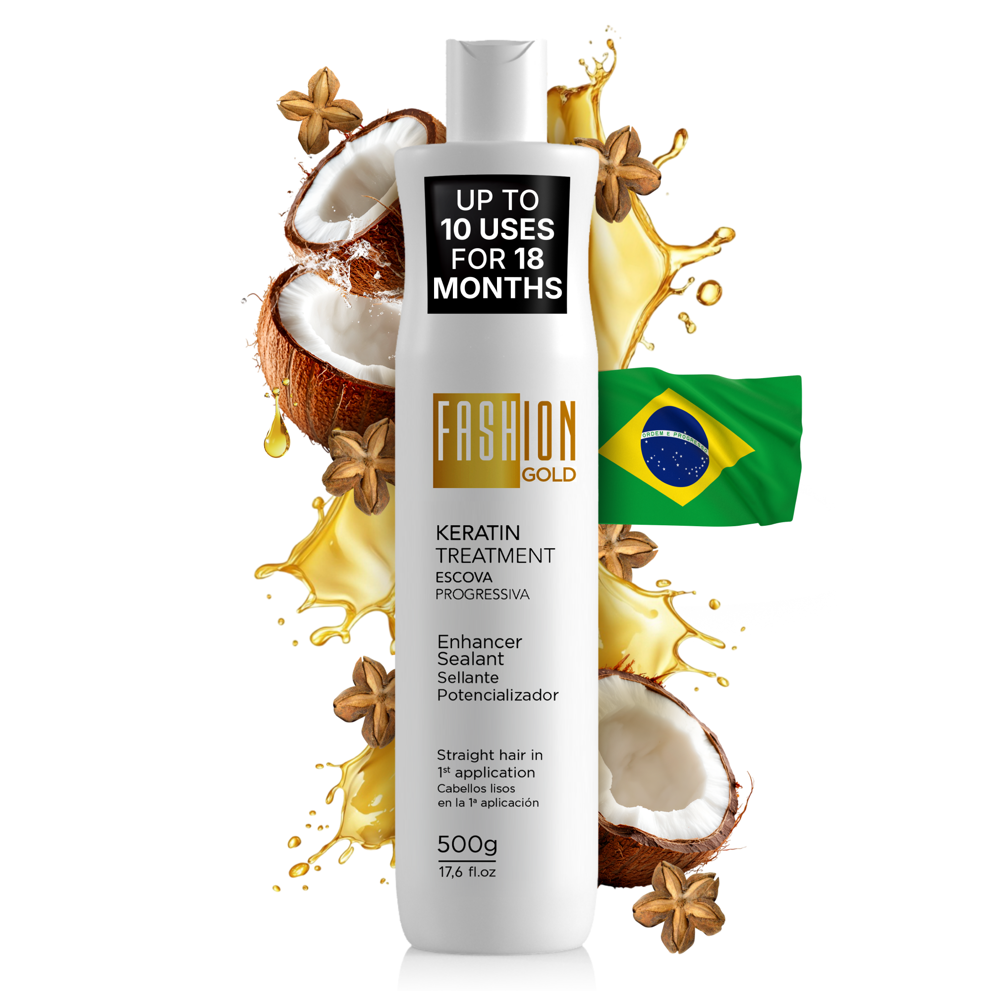
For a keratin treatment hero, I want the actual ingredients on the label (coconut, inca oil, and the golden keratin liquid itself) visible around the bottle. In the old workflow, that meant either sourcing stock photos that never quite matched, or buying the physical ingredients and shooting them. Now I generate them.
For a moisturizer, I want a swatch of the actual cream texture next to the jar. Generated.
For a serum, I want a single droplet caught mid-fall with the right viscosity. Generated.
The rule I follow religiously: the element I generate has to correspond to something that’s actually inside the product or stated on the label. Argan oil on the label means I can put argan oil in the frame. A vague “natural” claim does not give me license to put a forest behind the bottle. This is the line between “stand out” and “misleading,” and Amazon (and your buyers) can tell the difference.
Standing Out on the Search Page Without Breaking the Rules
This is where the strategy gets fun, and where most sellers get it wrong.
The mistake people make is thinking “stand out” means “add stuff.” More props, more colors, more elements. But Amazon will reject most of that, and even when it doesn’t, a cluttered hero loses to a clean one.
The smarter play is to use what Amazon already allows you to use (the product itself, the packaging, and a small amount of context drawn from the label) and arrange it in a way that nobody else on the page is doing.
Take a keratin treatment bottle. The search page is a sea of bottles photographed straight-on, dead center, against white. Beautiful, compliant, and completely interchangeable.
What I’d do instead: keep the bottle centered (because the product itself needs to read at thumbnail size), but build a full radial explosion behind it. The actual ingredients from the label (coconut and inca oil) arranged in a halo around the bottle, with golden keratin liquid splashing out in dynamic arcs. A subtle Brazilian flag tucked to the side to signal origin, since this is a Brazilian keratin treatment and that’s a meaningful category cue. Everything in the frame is allowed: the ingredients are on the label, the liquid represents what’s inside, the country of origin is stated on the packaging. Nothing is invented.
The composition is doing two things at once. The radial layout pulls the eye straight to the bottle (the splash literally points at it), and the volume of activity around the product makes the thumbnail look alive on a page full of static shots. That’s the click.
A few other category tactics worth stealing:
- Supplements: Show the bottle and a few pills or gummies in front of it. The pills are inside the bottle, so they’re not a misleading prop, and the visual immediately communicates form factor (capsule vs. gummy vs. tablet), which is often the buyer’s first question.
- Skincare: Show the product with a swatch or smear of the actual product texture next to it. Same logic. It’s what’s inside the package, and it tells the buyer something the bottle alone can’t.
- Food and beverage: Show the product with the ingredients it’s made from arranged behind or beside it. Coffee with beans. Tea with leaves. Protein powder with the actual fruit flavor.
- Tools and kitchenware: Show the full set laid out flat with everything that comes in the box. Buyers want to know what they’re getting before they click.
The common thread: everything in the frame must be either the product itself, the packaging, or something physically included in or stated on the label. Stay inside that rule and Amazon won’t touch you. Push the composition outside what your competitors are doing and you’ll get the click.
A few format-level tactics that also work:
- Use a vertical (3:4) crop when your category allows it. On mobile, where most buyers actually shop, a vertical hero takes up more screen real estate as the buyer scrolls. More screen time, more attention, more clicks.
- Tighten the framing so the product hits 85% of the frame. Amazon’s minimum is 80%, but competitors often hover at 50–60% because they’re afraid of cropping. Going tighter makes your image read as “confident” at thumbnail size.
The Honest Conclusion
AI has made the boring parts of hero image production faster. It’s made bad source photos salvageable. It’s made composition exploration cheaper. It’s made elements that used to require a photo shoot available in five minutes.
What it has not done, and won’t do anytime soon, is replace the strategic judgment about what makes a buyer click on your listing instead of the seventeen others on the page. That judgment comes from looking at the search results page for your specific category, understanding what your competitors are doing, knowing which Amazon rules you can push against and which you can’t, and testing real concepts with real buyers before you commit.
If you want hero images that are genuinely click-worthy, not just AI-polished versions of the same image everyone else on the page already has, that’s the work we do every day. Book a free consultation and we’ll take a look at your category, your competitors, and where your current hero is leaving clicks on the table.